Case study · Logo design
How to Make a Logo with AI: Exploring 3 Design Directions
Creating a logo with AI is easy; getting a symbol that actually represents a brand is not. Three directions for the ImagePromptBox icon, then a closer look at refining one and preparing it for real use.
Published: October 23, 2026
By ImagePromptBox Team
11 min read
Creating a logo with AI sounds simple enough. Describe a brand, enter a prompt, and generate a few images. But getting an image that looks impressive is different from creating a symbol that actually represents a brand.
When developing the visual identity for ImagePromptBox, my AI image-prompting tool, I wanted to explore more than one idea before settling on a direction. The brand connects AI, image creation, and creative inspiration, which gives me several ways to approach the logo.
Rather than trying to fit every idea into a single design, I explored three distinct concepts: an open 3D box, an abstract creative frame, and a geometric symbol that suggests ideas emerging into images.
In this case study, I'll walk through the design brief, the three prompts, and the decisions behind refining one concept. The aim is to show how I use AI image generation to explore logo ideas, not simply how to generate a random icon.
The Brand Brief
Before writing the prompts, I need a consistent visual direction for ImagePromptBox.
ImagePromptBox is an AI image-prompting tool designed for people who want to explore, create, and improve image prompts. The name itself suggests a container for creative ideas, but I don't want the logo to look like an ordinary storage box or a generic AI symbol.
I want the icon to feel modern, creative, and slightly futuristic without becoming visually complicated.
Here is the brief I used throughout the process:
- Brand: ImagePromptBox
- Product: An AI image-prompting and inspiration platform
- Brand personality: Creative, modern, expressive, and approachable
- Visual style: Minimalist geometry with a technology-meets-art aesthetic
- Color palette: Neon violet, magenta, and electric cyan
- Background: Dark charcoal
- Logo format: Standalone icon with no text
I'm deliberately keeping the brand name out of the generated artwork. I want to focus on the symbol itself, without introducing problems caused by AI-generated lettering. The wordmark can be designed separately later.
With the brief established, I can explore three concepts while keeping the overall visual identity consistent.
Direction 1: The Open 3D Box
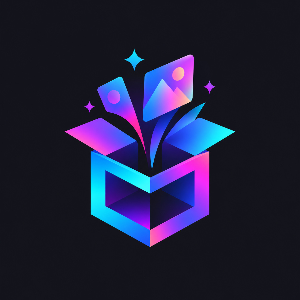
My first direction starts with the most direct interpretation of the ImagePromptBox name: an abstract open box.
I don't want a literal cardboard box. The shape should feel like a geometric frame or an open container for creative ideas. A subtle 3D perspective can give it depth, while the neon gradient makes it feel connected to digital art and AI-generated imagery.
The key is to keep the geometry simple. If the icon contains too many panels, edges, or glowing details, it may look more like a complex illustration than a recognizable brand mark.
Prompt A: Open 3D Box
A modern, creative vector logo icon for an AI image prompt library and inspiration platform. The icon features an abstract open 3D box or geometric frame, with clean angular edges and a sense of creative energy emerging from within. A vibrant multi-color gradient of neon violet, magenta, and electric cyan flows subtly across the geometric surfaces. Sleek minimalist geometry, tech-art fusion aesthetic, professional SaaS branding, strong silhouette, balanced proportions, flat vector-inspired design with subtle dimensional depth. Isolated on a solid dark charcoal background, high contrast, crisp edges, visually striking, centered composition. Icon only, no text, no letters, no typography, no mockup, no watermark.What I'm Looking For
The open-box concept gives the brand a visual anchor that connects naturally to its name. The challenge is making the shape distinctive rather than generic.
Three details matter here:
- The silhouette: Does the icon remain recognizable without its gradient?
- The geometry: Do the open edges suggest a creative space rather than an ordinary package?
- The lighting: Does the gradient enhance the shape without overpowering it?
This is the most literal of the three directions, but that isn't necessarily a disadvantage. A strong, simple geometric symbol can be easier to recognize and reuse across a website.
Direction 2: The Creative Frame
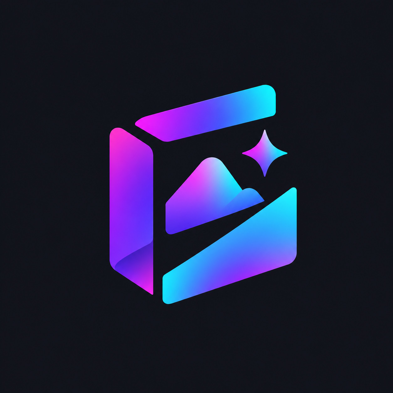
For the second direction, I moved away from the recognizable box structure and focused on an abstract geometric frame.
The frame represents the image side of ImagePromptBox. It can suggest a canvas, a visual window, or a space where an idea takes shape. Instead of relying on a three-dimensional box, this direction uses a more open, graphic structure.
I kept the same neon violet, magenta, and electric cyan palette. That way, the visual identity remains consistent even though the underlying symbol changes.
The important difference is the balance between solid shapes and negative space. I want the frame to feel open and creative rather than enclosed or overly technical.
Prompt B: Abstract Creative Frame
A modern, creative vector logo icon for an AI image prompt library and inspiration platform. The icon features an abstract geometric frame inspired by an open image canvas, built from a few bold, elegant shapes with carefully balanced negative space. The frame feels open, dynamic, and creative, suggesting a space where visual ideas take shape. A vivid gradient of neon violet, magenta, and electric cyan flows across selected surfaces, creating a sophisticated tech-art aesthetic. Sleek minimalist geometry, crisp contours, strong silhouette, professional digital product branding, clean vector style with subtle dimensional accents. Centered and isolated on a solid dark charcoal background, high contrast, visually balanced. Standalone icon only, no text, no letters, no typography, no mockup, no watermark.What I'm Looking For
This concept has a different strength from the open 3D box. It can communicate creativity through shape and negative space without depending on a literal object.
The question is whether the frame feels unique enough to belong to ImagePromptBox. A simple square outline is easy to generate, but it may also resemble countless existing app icons.
The solution isn't necessarily to add more details. A more distinctive arrangement of geometric segments, an unusual opening, or an asymmetric balance gives the symbol its own character.
The design also has to work as a flat, single-color icon. If its identity depends entirely on the glowing gradient, the underlying geometry needs more refinement.
Direction 3: Creative Ideas in Motion
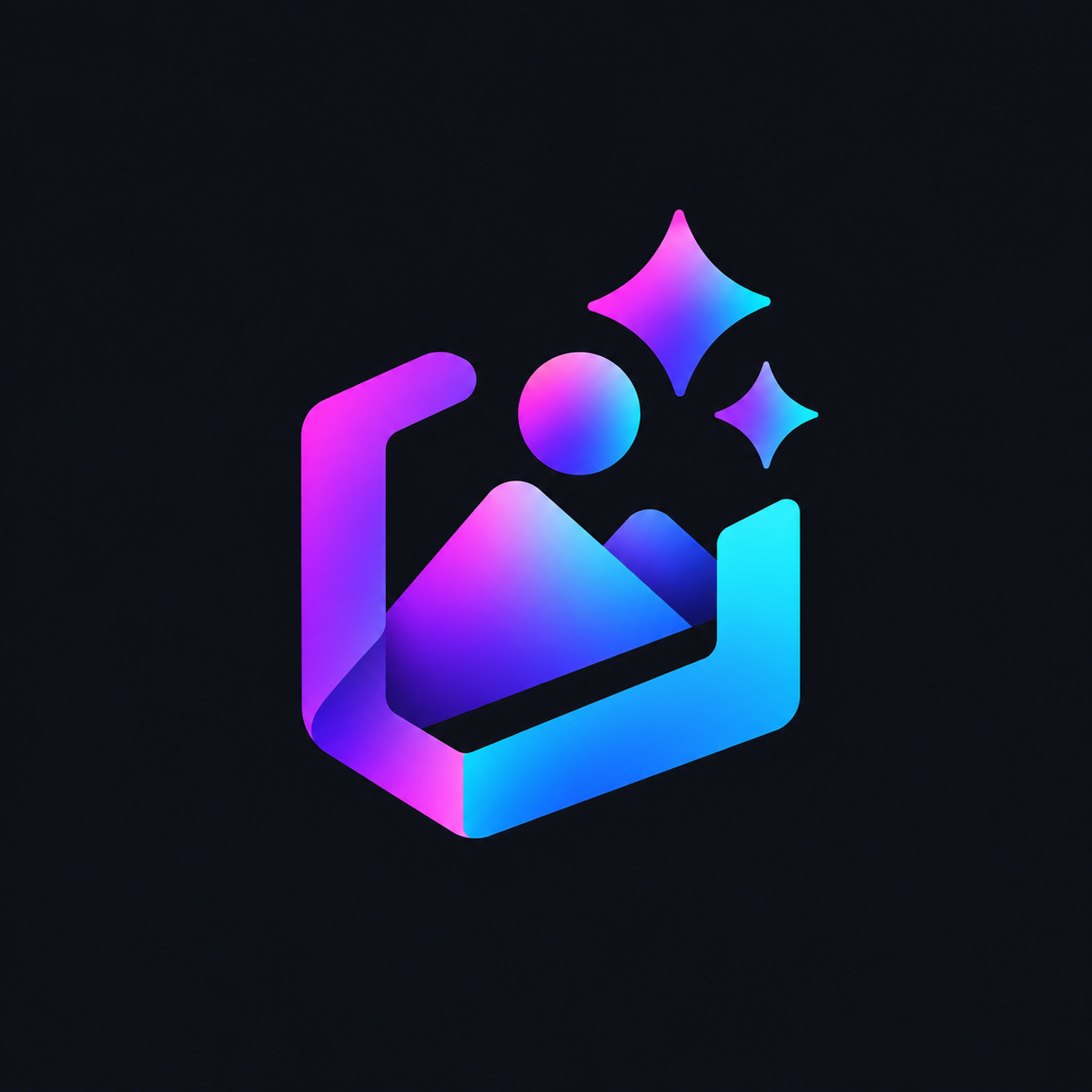
The third direction is more expressive.
Instead of representing a box or frame directly, I explored the idea of something emerging from a geometric structure. This connects to the process behind AI image generation: a written prompt becomes a visual result.
The icon could use a compact geometric base with a few abstract shapes extending outward. The goal isn't to illustrate a complete scene or fill the logo with decorative particles. It's to suggest movement and creative transformation using as few elements as possible.
This direction gives me more freedom to explore an original symbol, but it also requires more restraint. If the shapes become too scattered, the icon may lose the clarity a logo needs.
Prompt C: Creative Ideas in Motion
A modern, expressive vector logo icon for an AI image prompt library and inspiration platform. The icon features a compact abstract geometric frame with a few carefully arranged shapes emerging from its center, symbolizing creative ideas transforming into visual images. Use bold, controlled geometry and intentional negative space to create a distinctive, cohesive silhouette. Apply a vibrant gradient of neon violet, magenta, and electric cyan to selected geometric surfaces, with a sophisticated futuristic tech-art aesthetic. Minimalist composition, professional SaaS branding, crisp vector-style edges, subtle dimensional depth, strong contrast, visually balanced and memorable. Isolated on a solid dark charcoal background, centered composition. Standalone icon only, no text, no letters, no typography, no scattered decorative particles, no mockup, no watermark.What I'm Looking For
The biggest challenge here is controlling the sense of movement.
A few shapes emerging from a frame can communicate creative energy. Too many shapes, however, can make the icon feel fragmented or unnecessarily complicated.
Look for a clear visual hierarchy: one dominant geometric structure, supported by a small number of secondary elements. The eye should understand the overall shape quickly instead of having to inspect every detail.
This direction is the most conceptual of the three. It may offer a more expressive identity, but it also has to work harder to remain simple and recognizable.
Comparing the Three Directions
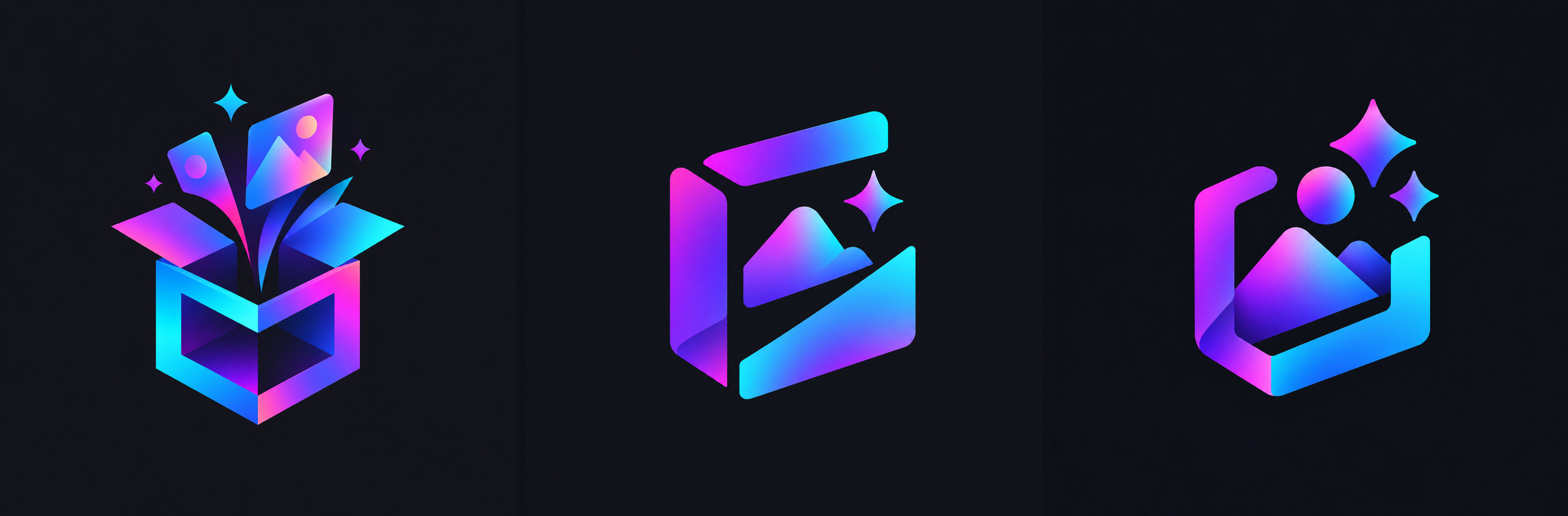
The choice isn't about which direction has the most dramatic glow or the most intricate geometry. Those qualities can make an image look impressive without necessarily making it a better logo.
I compared the concepts using a few practical criteria.
| Criterion | What to evaluate |
|---|---|
| Brand connection | Does the symbol relate to images, prompts, or creative ideas? |
| Recognizability | Is the overall silhouette easy to distinguish? |
| Simplicity | Can unnecessary shapes be removed without losing the concept? |
| Small-size usability | Would the icon remain readable as a small website or app icon? |
| Visual consistency | Does it fit the intended neon-on-charcoal identity? |
The three directions approach the same brief in different ways.
The open 3D box connects most directly to the brand name. The creative frame emphasizes the visual canvas. The ideas-in-motion concept focuses on the transformation from a prompt into an image.
I used these differences to decide which concept deserved further refinement. They describe how the three symbols approach the brief; they don't establish that one direction is objectively better.
For ImagePromptBox, I took the open box forward: it had the clearest silhouette and the strongest connection to the product, and the next step was to simplify it further.
Refining the Chosen Concept
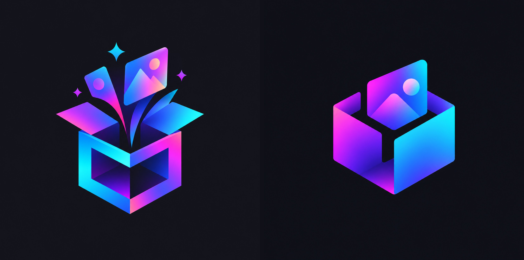
Once the direction was selected, I stopped exploring completely new concepts for a moment and focused on the details that matter most.
This is where prompt writing becomes more specific. Instead of asking for a logo that is simply more futuristic or more beautiful, I defined what needed to improve.
For example, if the first concept has too many glowing edges, reduce the number of illuminated surfaces. If the silhouette is difficult to recognize, simplify the geometry. If the icon looks like a generic cube, adjust the structure to give it a more distinctive outline.
Improved Prompt
A refined, distinctive vector logo icon for ImagePromptBox, an AI image prompt library and inspiration platform. Create a single abstract geometric symbol based on an open 3D box or architectural frame, with a clean, memorable silhouette and carefully controlled proportions. Integrate a subtle sense of creative energy through the shape itself rather than adding many decorative elements. Use a sophisticated gradient of neon violet, magenta, and electric cyan on selected surfaces, against a solid dark charcoal background. Minimalist geometry, tech-art fusion, professional digital brand identity, crisp contours, balanced negative space, high contrast, clean vector-inspired finish with restrained dimensional depth. The icon must remain visually clear when reduced in size. Centered composition, standalone symbol only. No text, no letters, no typography, no extra symbols, no scattered particles, no mockup, no watermark.The main change here is the emphasis on a recognizable silhouette, restrained lighting, and controlled geometry.
I'm not asking the model to add more visual effects. I'm asking it to make the central idea clearer.
What to Check in the Refined Version
The comparison above puts the initial and refined concepts side by side. Look for specific improvements.
First, does the shape read more clearly? Second, is the gradient helping to define the geometry, or is it distracting from it? Third, can I remove any remaining detail without weakening the design?
These questions are more useful than judging the result only by whether it looks polished at full size.
The comparison should reflect the actual images generated. If the refined version introduces a new problem, adjust the prompt again rather than assuming that the longer prompt must produce a better result.
Preparing the Logo for Real Use
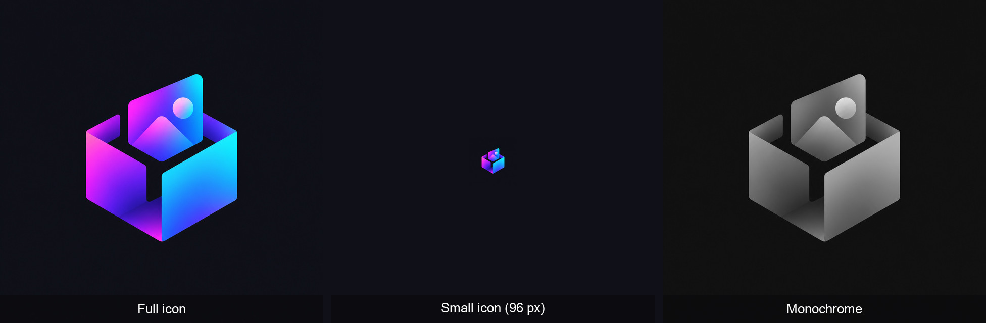
A generated logo concept still needs to be checked before I use it as part of a real product.
For ImagePromptBox, I checked three practical applications.
1. The primary icon
The full-color version can use the neon gradient on a dark charcoal background. This is the version that best expresses the visual direction described in the prompts.
2. The small icon
Reducing the symbol to a small size shows whether its edges, openings, and internal shapes remain distinguishable. If the details merge together, simplify the icon rather than relying on a stronger glow.
3. The monochrome icon
The same check applies to a single-color version: a good symbol should have a recognizable structure even when the gradient is removed.
There is another practical consideration: an AI-generated image isn't automatically a production-ready vector asset. For a clean SVG, recreate or trace the final design in a vector editor and verify that its shapes are consistent.
Since the logo is intended to represent a real brand, check for visual similarities to existing logos before committing to the design.
What I Learned from Exploring These Directions
The most useful part of this workflow is that it separates visual exploration from refinement.
When I start with a single prompt, it's easy to become attached to the first attractive result. Exploring three distinct directions gives me a broader set of possibilities and makes the design decisions easier to explain.
It also changes how I think about prompt improvements.
Adding more adjectives isn't always the answer. For a logo, a few well-defined geometric constraints can be more useful than a long list of effects. The shape, silhouette, negative space, and color distribution all contribute to how the icon is perceived.
For ImagePromptBox, the three directions offer different ways to express the same brand: a box that holds creative possibilities, a frame that represents the image canvas, and a geometric structure that suggests ideas becoming images.
The next step is not to keep adding details. It's to identify the strongest concept, remove anything that doesn't support it, and make sure the symbol works beyond a large preview image.
That's the approach taken here: use the model to explore possibilities, use clear design criteria to evaluate them, and treat the final generated image as a starting point for a usable brand asset rather than the finished product.