Prompt techniques · Composition
How to Control Composition With AI Image Prompts
Describe how the elements in an image should be arranged, not just what should appear. Here is what centered composition, rule of thirds, negative space, and leading lines each actually control.
Published: October 16, 2026
By ImagePromptBox Team
12 min read
You can describe a subject perfectly and still get an image that feels wrong.
Maybe the person is too close to the edge. Maybe there's no room for a headline. Or maybe the background is so busy that the subject gets lost in it.
These aren't always problems with the subject description. They're often composition problems.
Instead of adding more details about what should appear in the image, try describing how those elements should be arranged.
A few words can make a noticeable difference: centered composition, rule of thirds, negative space, or strong leading lines.
The trick is knowing what each one actually controls.
Start With the Same Subject
Let's use one simple scene throughout the examples:
A professional entrepreneur standing in a modern office, wearing a dark business suit, natural window light, realistic photography.This gives the image model a subject, setting, lighting, and visual style. But it doesn't tell the model where to place the person or how to organize the space around them.
That's what the composition instructions are for.

For a fair comparison, keep the subject and scene as consistent as possible while changing the composition instruction. Image models may still change small details between generations, so focus on the overall layout rather than expecting pixel-perfect consistency.
Centered Composition: Put the Subject in the Middle
Use a centered composition when you want the subject to be the obvious focal point.
A professional entrepreneur standing in a modern office, wearing a dark business suit, centered composition, subject positioned in the middle of the frame, balanced space on both sides, realistic photography.
This is a good starting point for profile images, straightforward portraits, and images where the subject should command attention.
The phrase subject positioned in the middle of the frame reinforces the instruction instead of relying entirely on the word centered.
But centered doesn't always mean symmetrical. If you want a symmetrical image, say so explicitly:
centered composition, symmetrical architecture, balanced visual elements on both sidesThat gives the model a clearer idea of what should be balanced.
Rule of Thirds: Move the Subject Off-Center
A centered composition is easy to understand. The rule of thirds is more useful when you want the image to feel less static or need room for other elements.
Imagine dividing the frame into a three-by-three grid. The idea is to position important elements near the grid lines or their intersections rather than automatically placing everything in the middle.
Try this:
A professional entrepreneur standing in a modern office, wearing a dark business suit, rule-of-thirds composition, subject positioned along the right third of the frame, looking slightly toward the open space on the left, realistic photography.
Notice the extra instruction: subject positioned along the right third of the frame.
That's useful because simply writing rule-of-thirds composition doesn't tell the model which side should contain the subject.
If you're creating a website banner or an advertisement, this arrangement can also leave room for a headline or other design elements.
For example:
rule-of-thirds composition, subject on the right third, clean open space on the left for headline textThis is more actionable than asking for a generally pleasing composition.
Negative Space: Leave Room for the Message
Negative space is the relatively uncluttered area around your main subject. It doesn't have to be completely empty; it just shouldn't compete with the subject.
This is especially useful for product advertisements, website hero images, thumbnails, and social media graphics.
A professional entrepreneur standing on the right side of a modern office, generous negative space on the left, clean uncluttered background, soft natural window light, realistic photography.
The important distinction is that negative space is about the visual breathing room around the subject, not simply making the background blurry.
A blurred background can still be full of bright lights, furniture, and distracting shapes. Negative space asks for an area with less visual activity.
If the image is intended for a landing page, be more specific:
wide horizontal composition, subject on the right, large clean area on the left reserved for a headline and short text, minimal visual clutterOne practical note: if you need readable text in the final design, it's usually more reliable to generate the image with room for text and add the typography afterward.
Leading Lines: Guide the Eye
Leading lines are visual lines that direct attention toward a subject or another important part of the image.
Roads, corridors, desks, railings, walls, and architectural edges can all create them.
A professional entrepreneur standing in a modern office corridor, strong leading lines formed by the walls and floor converging toward the subject, realistic photography, natural window light.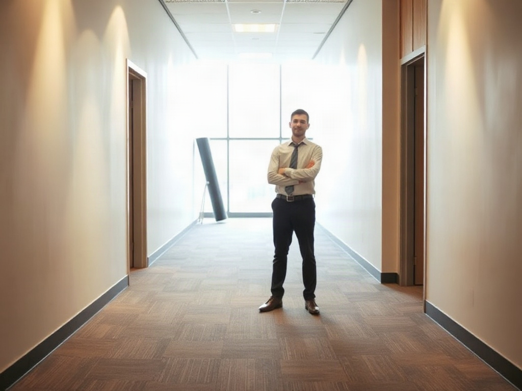
Here, the lines aren't just decoration. They help establish a visual path through the image.
This technique is particularly useful when the environment matters as much as the person.
You can also control where the lines lead:
strong diagonal leading lines guiding the viewer's eye toward the subjectIf you want a calmer composition, use lines that converge gently. For a more dramatic perspective, use a long corridor or a low viewpoint with stronger converging lines.
The key is to give the model something in the scene that can actually form those lines. Asking for leading lines in a plain room with no useful architectural features may not change much.
Depth: Make the Scene Feel Three-Dimensional
A composition can look flat even when the subject and background are both detailed.
To suggest depth, describe spatial relationships and the way objects recede into the distance.
A professional entrepreneur standing in a spacious modern office, clear separation between the subject and distant background, visible depth through the room, realistic photography, natural window light.
Depth is not a single composition setting. It's an effect you can encourage through perspective, overlapping objects, lighting, and differences in focus.
For a stronger sense of distance, try:
deep perspective, architectural elements receding into the distance, foreground-to-background separation, realistic photographyThis can be useful for architectural scenes, environmental portraits, and images where you want the setting to feel spacious rather than like a flat backdrop.
Layers: Build the Image in Stages
Layered composition uses elements at different distances from the camera to create a more structured scene.
Think of a plant near the camera, a person in the middle, and windows or furniture farther back.
A professional entrepreneur standing in a modern office, layered composition with a plant in the foreground, the entrepreneur in the middle ground, and office windows in the background, realistic photography.
The difference between depth and layers is subtle but useful.
Depth describes the feeling of distance. Layers describe how the scene is organized into distinct spatial planes.
You can have a deep scene without obvious foreground objects. Adding layers gives the model more concrete elements to arrange.
This is especially helpful when a portrait looks too much like a cutout placed against a background.
Foreground: Give the Front of the Frame a Job
Foreground elements sit close to the camera, in front of the main subject.
They might be a desk edge, a chair, a plant, a doorway, or another person partially entering the frame.
A professional entrepreneur working in a modern office, photographed from behind the edge of a desk, subtle desk objects in the foreground, subject clearly visible in the middle ground, realistic photography.
A foreground element can make a scene feel more natural and give the viewer a sense of where the camera is positioned.
But it can also get in the way.
If the foreground object becomes too large or visually dominant, the main subject may lose attention. When that happens, specify that the foreground should remain subtle or partially out of focus.
For example:
subtle foreground framing, blurred edge of a nearby plant, main subject unobstructed and in sharp focusUse foreground elements because they contribute to the composition, not simply because you want the image to look more elaborate.
Background Blur: Separate the Subject From the Scene
Background blur is often used in portrait photography to make the subject stand out.
A professional entrepreneur standing in a modern office, shallow depth of field, softly blurred office background, subject in sharp focus, realistic photography.
This is different from negative space.
- Negative space reduces visual competition around the subject.
- Background blur reduces the visible detail and sharpness of objects behind the subject.
You can use both together:
subject positioned on the right third, generous negative space on the left, softly blurred background, subject in sharp focusHowever, don't blur every background automatically. If the architecture, workspace, or environment helps tell the story, keeping more of it in focus may produce a more useful image.
Environmental Composition: Show the Person in Context
Sometimes the environment is part of the story.
An environmental portrait shows the person in relation to the place where they work, live, or spend time. The subject remains important, but the surrounding scene helps explain who they are or what they're doing.
A professional entrepreneur standing beside a large window in a modern office, wider environmental portrait, desk and workspace visible, subject integrated naturally into the setting, realistic photography.
Compare this with a tight headshot. The headshot emphasizes facial features; the environmental portrait tells you more about the person's surroundings.
For this type of image, phrases such as wide environmental portrait, workspace visible, and subject integrated into the setting are often more useful than adding generic style adjectives.
If the setting matters, don't let the model crop most of it away. Specify the framing as well as the environment.
Indoors and Outdoors: Establish the Scene First
Indoors and outdoors aren't composition rules in the same sense as centered composition or leading lines. They describe the setting.
Still, they matter because the environment determines which composition options are available.
Indoors
A professional entrepreneur standing in a modern office, indoor setting, large windows, desks and architectural details arranged naturally around the subject, balanced composition, realistic photography.
Indoor settings offer useful elements such as doorways, desks, corridors, windows, and walls. These can create framing, layers, and leading lines.
If the room looks too crowded, specify which elements should remain visible and which should stay out of the way.
Outdoors
A professional entrepreneur standing in a modern city plaza, outdoor setting, buildings receding into the distance, natural daylight, subject positioned on the right third, open space on the left, realistic photography.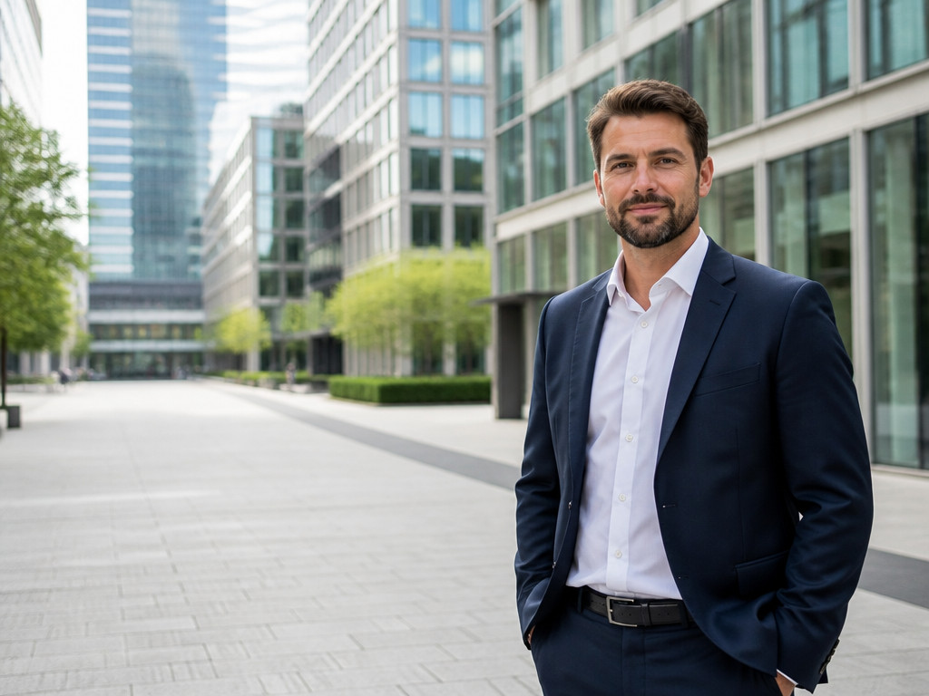
Outdoor environments give you different tools: roads, pathways, buildings, trees, open sky, and distant scenery.
The setting alone won't guarantee a good composition. Combine it with a clear instruction about subject placement or the direction in which you want the viewer's eye to travel.
What Actually Makes the Biggest Difference?
These prompts control different aspects of the image. Treating them as interchangeable is a common source of confusion.
Here's a quick way to choose:
| If you want... | Try... |
|---|---|
| A direct, balanced portrait | centered composition |
| A more dynamic, off-center arrangement | rule-of-thirds composition |
| Room for a headline or logo | generous negative space on the left |
| The viewer's eye drawn toward the subject | strong leading lines toward the subject |
| A stronger sense of distance | deep perspective, elements receding into the distance |
| Clear spatial organization | layered foreground, middle ground, and background |
| A sense of place | wide environmental portrait, surroundings visible |
| A portrait with less background distraction | shallow depth of field, softly blurred background |
The most useful instruction is usually the one that describes the visual result you want.
For example, negative space is a helpful term, but large clean area on the left for headline text is more specific when you're designing an advertisement.
Likewise, layers gives the model a general idea. A plant in the foreground, the person in the middle ground, and windows in the background tells it how to build the scene.
Common Composition Prompt Mistakes
1. Asking for Everything at Once
centered composition, rule of thirds, symmetrical framing, subject on the far leftThese instructions can conflict. A centered subject and a subject on the far left require different arrangements.
Choose one primary layout first. Add other instructions only when they support it.
2. Naming a Technique Without Specifying the Result
negative space, leading lines, depthThese terms are useful, but they leave plenty of room for interpretation.
Try describing the intended outcome:
subject on the right, clean empty space on the left, office corridor lines leading toward the subject, background receding into the distance3. Confusing Blur With Empty Space
A blurred background can still contain distracting shapes and bright objects. If you need room for text, ask for uncluttered space in a specific area instead of relying on background blur alone.
4. Adding Details That Don't Help the Layout
More objects don't necessarily create better composition. If a foreground plant, extra furniture, and decorative props don't help direct attention or establish depth, leave them out.
A Simple Composition Prompt Formula
You don't need to use all eleven terms in every prompt.
Start with this structure:
[subject and setting], [primary composition], [subject placement], [foreground/background relationships], [visual style]For example, a website hero image:
A professional entrepreneur standing in a modern office, rule-of-thirds composition, subject positioned on the right third of the frame, generous clean negative space on the left for headline text, subtle foreground framing, softly blurred office background, realistic photography.For a more cinematic environmental portrait:
A professional entrepreneur standing in a modern office corridor, wide environmental portrait, strong leading lines guiding the eye toward the subject, layered foreground and background, deep perspective, natural window light, realistic photography.For a clean profile image:
A professional entrepreneur in a modern office, centered composition, symmetrical framing, uncluttered background, subject in sharp focus, realistic photography.Each prompt has a clear priority. One establishes subject placement, another uses the environment to create depth, and the third keeps the frame simple.
That's a better starting point than combining every composition keyword you know.
The Takeaway
When an AI-generated image feels wrong, the subject description may not be the problem. The model might simply be arranging the scene differently from what you imagined.
Start by deciding where the subject belongs. Then think about what should surround it, where the viewer's eye should go, and how much space the image needs.
If you're unsure which instruction to use, change one composition variable at a time. It's easier to understand what works when you can see exactly what changed.