Case study · Food photography
How to Generate FOOD PHOTOGRAPHY Using AI: 3 Styles for One Ramen Dish
AI food photography isn't just about making food look delicious. The same bowl of ramen can feel cozy, fresh, or luxurious depending on how the lighting, background, colors, and composition work together.
Published: October 16, 2026
By ImagePromptBox Team
10 min read
AI food photography isn't just about making food look delicious. The same bowl of ramen can feel cozy, fresh, or luxurious depending on how the lighting, background, colors, and composition work together.
For this case study, I wanted to explore three different ways to generate food photography using AI. I used the same subject—a rustic bowl of steaming ramen—and approached it from three visual directions: moody editorial photography, bright and fresh food photography, and premium advertising.
My goal wasn't to find one universally best style. I wanted to understand how different prompt choices could make the same dish more suitable for different restaurant brands and design projects.
The Food Photography Brief
I started with a simple subject: a rustic ceramic bowl filled with steaming ramen.
I wanted the noodles and broth to remain the main focus, with a few carefully chosen details to make the scene feel believable. Chopsticks, sesame seeds, and fresh scallions would add context without turning the image into a cluttered still life.
Rather than changing the dish for each version, I explored three different visual treatments.
Here's the basic setup I used for this case study:
- Subject: A bowl of steaming ramen
- Model: Flux
- Model version: Flux.1 dev
- Aspect ratio: 16:9
- Steps: 30
- CFG: 3.5
- Primary use cases: Restaurant menus, food branding, product photography, and recipe card design
I used the same model and generation settings as the starting point for all three directions. This gives me a consistent framework for exploring the prompts, although individual outputs can still vary because of sampling and other generation factors.
Direction A: Moody Editorial Food Photography
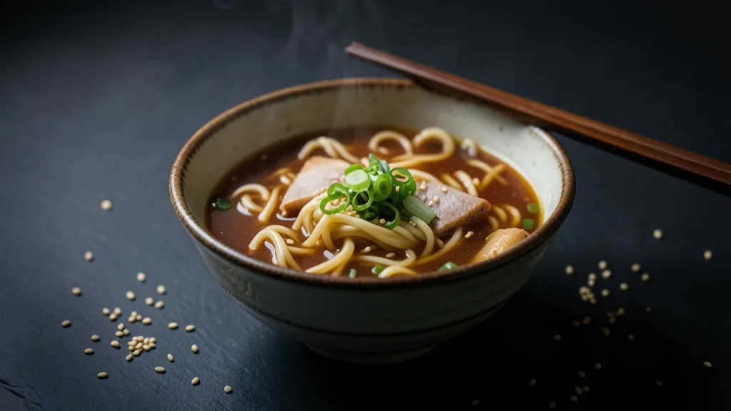
For the first direction, I wanted something dramatic and atmospheric. I imagined a restaurant menu with a dark background, warm broth, visible steam, and soft light falling across the bowl from one side.
This style works well as a creative direction for restaurant branding, especially when the goal is to create a rich, intimate, or slightly cinematic mood.
The Prompt I Used
Moody food photography hero shot of a rustic ceramic bowl filled with steaming ramen, soft side light from the left, deep shadows, dark slate background, chopsticks resting on the bowl, scattered sesame seeds and scallions, rich warm broth tones, shallow depth of field, menu-cover composition, 16:9Why I Chose These Details
Soft side lighting
I specified soft light coming from the left because I wanted the bowl, noodles, and toppings to have visible shape and texture. Side lighting can help reveal the surface of the broth and create a more dimensional look than uniformly distributed light.
Deep shadows and a dark slate background
I wanted the background to support the food rather than compete with it. A dark slate surface gives the scene a restrained, editorial feel, while deeper shadows help establish the mood.
There's one thing I'd watch for here: if the bowl and background are both too dark, their edges may become difficult to distinguish. The goal is contrast, not simply making everything darker.
Steam, sesame seeds, and scallions
These details help communicate that the ramen is freshly served. The steam adds atmosphere, while the scallions and sesame seeds provide small areas of color and texture.
I kept the supporting elements relatively simple because I didn't want the garnishes to become more visually important than the food itself.
Shallow depth of field
I included shallow depth of field to encourage attention toward the bowl and its toppings. For a menu hero image, though, I'd still want the most important parts of the dish to remain recognizable and reasonably sharp.
What I'd Look For in the Result
When evaluating this version, I'd check whether the light actually separates the bowl from the background, whether the broth looks appetizing rather than muddy, and whether the steam feels natural.
I'd also check the overall composition. If the image needs a headline or restaurant name, I may need to generate another version with more deliberate negative space.
The key idea behind this direction is simple: use lighting and tonal contrast to create atmosphere, rather than relying on the word "moody" alone.
Direction B: Bright and Fresh Food Photography
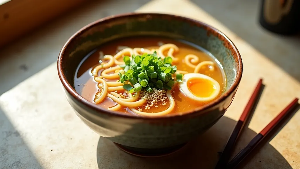
For the second direction, I would keep the same ramen dish but change the visual language completely.
Instead of deep shadows and a dark slate background, I'd explore soft daylight, a lighter surface, natural colors, and a more open composition. The goal is to make the food feel fresh, approachable, and suitable for a casual dining brand.
I would use this direction for a restaurant that wants its menu to feel clean and welcoming, or for a recipe card where the food needs to be easy to see at a glance.
The Prompt I Used
Bright editorial food photography of a rustic ceramic bowl filled with freshly prepared ramen, soft natural window light from the left, gentle shadows, light warm stone tabletop, clear golden broth, fresh green scallions, delicate sesame seeds, chopsticks placed neatly beside the bowl, natural food colors, inviting atmosphere, realistic noodle and broth textures, balanced composition, airy background, shallow depth of field, professional restaurant menu photography, horizontal 16:9 compositionWhat Changes in This Version?
Natural window light instead of dramatic shadows
I replaced the darker lighting direction with soft natural light. The intention is to make the food look fresh and approachable while preserving enough shadow to give the bowl depth.
A lighter background
A warm stone tabletop creates a different visual mood from dark slate. It can also help the green scallions and golden broth stand out without relying on strong contrast.
A cleaner arrangement
I described the chopsticks as neatly placed beside the bowl. This gives the composition a more controlled feel and reduces the risk of the surrounding props competing for attention.
Natural color instead of cinematic warmth
I still want the broth to look rich, but I wouldn't push the warm color grading as strongly as I would in the moody version. The intention is to preserve a fresh, natural appearance.
When I'd Choose This Direction
I'd consider this style for casual restaurants, recipe cards, food blogs, and brands that use bright, clean visual identities.
However, brighter isn't automatically better. If the light becomes too flat, the noodles and toppings may lose their texture. I'd still look for gentle shadows and enough tonal variation to keep the food visually interesting.
The main lesson here is that changing the lighting and environment can shift the perceived personality of the same dish without changing the subject itself.
Direction C: Premium Food Advertising
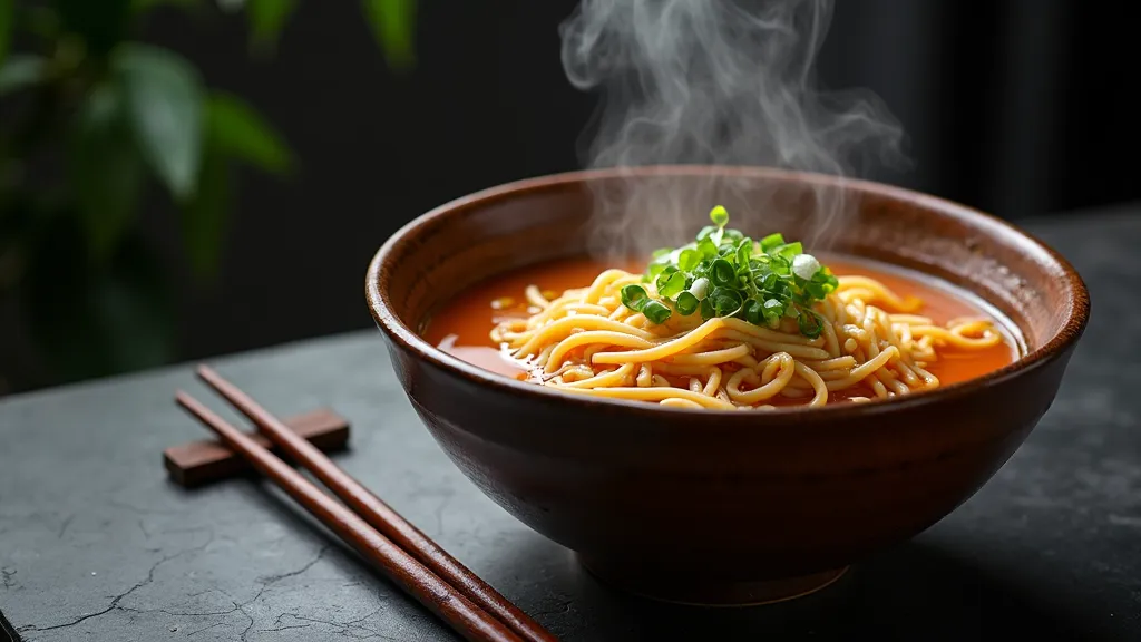
For the third direction, I'd approach the ramen as the hero product in a commercial campaign.
This isn't simply the moody version with more adjectives. I'd pay closer attention to the hierarchy of the composition, the presentation of the food, the relationship between the subject and the background, and how the image might be used in a real advertising layout.
I would aim for a polished, deliberate look with carefully controlled lighting and a clear focal point.
The Prompt I Used
Premium commercial food advertising photography featuring a beautifully presented rustic ceramic bowl of steaming ramen, rich amber broth with detailed surface texture, neatly arranged noodles and fresh scallion garnish, elegant directional studio lighting, controlled highlights on the broth, sculpted shadows, dark charcoal background with subtle texture, carefully styled chopsticks beside the bowl, refined composition, hero product positioned on the right third of the frame, generous clean negative space on the left for advertising copy, premium editorial color grading, crisp focus on the ramen toppings, realistic food textures, high-end restaurant campaign aesthetic, horizontal 16:9 compositionWhat I Changed and Why
More attention to food presentation
For a commercial image, I want the dish to look intentional rather than randomly arranged. Describing neatly arranged noodles and fresh garnish gives the model more direction about the presentation I have in mind.
Controlled highlights
I included controlled highlights on the broth because the surface needs to look rich and dimensional without becoming an indistinct patch of glare.
A more deliberate subject position
I specified that the bowl should sit on the right third of the frame, leaving space on the left for advertising copy.
This is one of the biggest differences from my original prompt. "Menu-cover composition" describes a general purpose, but it doesn't clearly communicate where the main subject should sit or where text might go.
Negative space for typography
I added a clear instruction for empty space on the left. This doesn't guarantee a perfectly clean area, but it gives the model a more specific composition target.
I would still add the actual headline and brand elements during graphic design rather than expecting the image generator to produce accurate advertising typography.
What I'd Evaluate
For this direction, I'd focus on three things:
- Product hierarchy: Does the ramen attract attention immediately?
- Composition: Is there enough usable space for copy, a logo, or a promotional message?
- Food presentation: Do the noodles, broth, and garnishes look appealing and visually coherent?
A beautiful food photograph isn't automatically a good advertising asset. If the subject fills the entire frame and leaves no room for the campaign message, I may need to generate a more compositionally controlled version.
The main difference in this direction is that I'm not only describing how the food should look. I'm also describing how the image needs to function in a commercial layout.
Comparing the Three Directions
Each direction solves a slightly different visual problem.
| Element | Moody Editorial | Bright & Fresh | Premium Advertising |
|---|---|---|---|
| Lighting | Soft side light, deep shadows | Natural daylight, gentle shadows | Controlled directional studio light |
| Background | Dark slate | Light warm stone | Refined dark charcoal |
| Color treatment | Rich, warm, cinematic | Natural and airy | Polished, carefully controlled |
| Composition | Atmospheric food hero | Open, approachable scene | Deliberate subject placement and negative space |
| Main purpose | Restaurant identity and menu covers | Casual dining and recipe content | Campaigns and premium brand advertising |
The table compares the three directions. Each row describes what one prompt asked for, and the images above are the outputs it produced.
I generated all three from the same subject and settings and compared the results side by side. What a prompt asks for is not always the same as what the model delivers.
That distinction matters because a prompt describes what I'm asking for, not what the model will always deliver.
What I Learned From Designing These Prompts
Working through these three directions highlights a useful principle: food photography prompts need more than a list of ingredients and visual adjectives.
1. Lighting Does More Than Change Brightness
The lighting direction influences the mood, the visibility of texture, and the separation between the dish and its environment.
Soft side light can support a dramatic editorial look, while brighter natural light can create a more casual atmosphere. For a commercial image, more deliberate control over highlights and shadows can help establish a clear focal point.
2. Backgrounds Should Support the Food
A dark slate surface and a light stone tabletop can communicate very different visual moods, even when the bowl and its ingredients remain unchanged.
I would choose the background based on the intended brand and use case instead of adding decorative details without a clear purpose.
3. Composition Needs to Match the Intended Use
If I'm generating an image for a restaurant menu, I need to think beyond whether the food looks good.
Will the image crop well? Is the bowl placed where I need it? Is there enough room for typography? Can the image work in a horizontal layout?
Adding these requirements to the prompt gives the model more direction, although the output still needs to be checked.
4. More Descriptive Text Isn't Always Better
It's tempting to keep adding words such as cinematic, luxurious, dramatic, realistic, premium, and highly detailed.
But I prefer to give each phrase a job. One part of the prompt defines the food, another establishes the lighting, and another controls the composition or intended use.
If two descriptions pull the image in different directions, I would simplify them before adding even more detail.
Final Thoughts
For me, the most useful way to approach AI food photography is to start with the job the image needs to do.
If I want a dramatic restaurant menu visual, I'd begin with the moody editorial direction. If the brand feels fresh and approachable, I'd try natural light and a lighter background. If the image needs to support a commercial campaign, I'd pay more attention to product placement, controlled highlights, and negative space.
I wouldn't assume that one prompt is universally better than the others. I choose a direction, generate the image, inspect what the model actually produced, and refine the prompt based on the result.
The same bowl of ramen can support very different visual identities. The prompt is how I communicate which one I'm trying to create.
Frequently Asked Questions
Do these prompts work with a different dish?
The food is named in only a few clauses, while the lighting, background, and composition are described separately, so most of the text carries over to another dish. The part worth re-checking is contrast: the same ceramic bowl was used against both dark slate and light stone here, and whether a differently colored dish separates as clearly on both surfaces was not tested in this study.
Which direction should I start from?
Start from how the image will be used rather than from which style looks best. Of the three, only the premium direction reserves a clean area for a headline or logo, so if the image has to carry copy, that is the one to begin with. The comparing table above maps each direction to the job it was written for.
Do I need to change the prompt for a square or vertical crop?
Yes, the composition clauses would need rewriting. All three prompts were written for a horizontal 16:9 frame, and instructions such as placing the bowl on the right third depend on that width — the same placement reads differently in a square or vertical crop. No other aspect ratio was generated for this study.